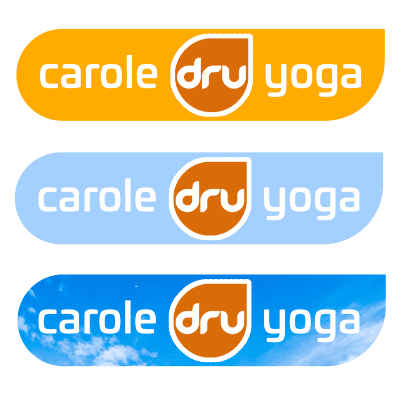

Carole had been running her yoga classes for several months but, alongside a new website, wanted a more defined brand. As a certified practitioner of Dru Yoga she is sanctioned to use the Dru logo ( as seen here ) anywhere in her marketing.
I thought that the closer we could align Carole to the Dru the brand, the better. With this in mind i set about with a few ideas that really just looked like an extension of the parent brand.
Very quickly i settled on using the 2 elements of the Dru logo on Carole’s own design. The teardrop shape that is created by one square corner and 3 fully rounded corners, and a close typeface match that is similar and complements without being a copy.
Carole agreed with the vision and we settled on a few variations that could be used on the site and any advertising material.